DBDA
Building a new
identity for an
architectural studio
Logo as the cornerstone of
a visual identity
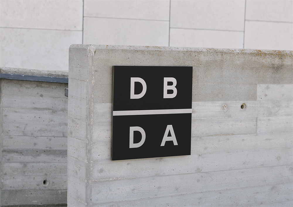
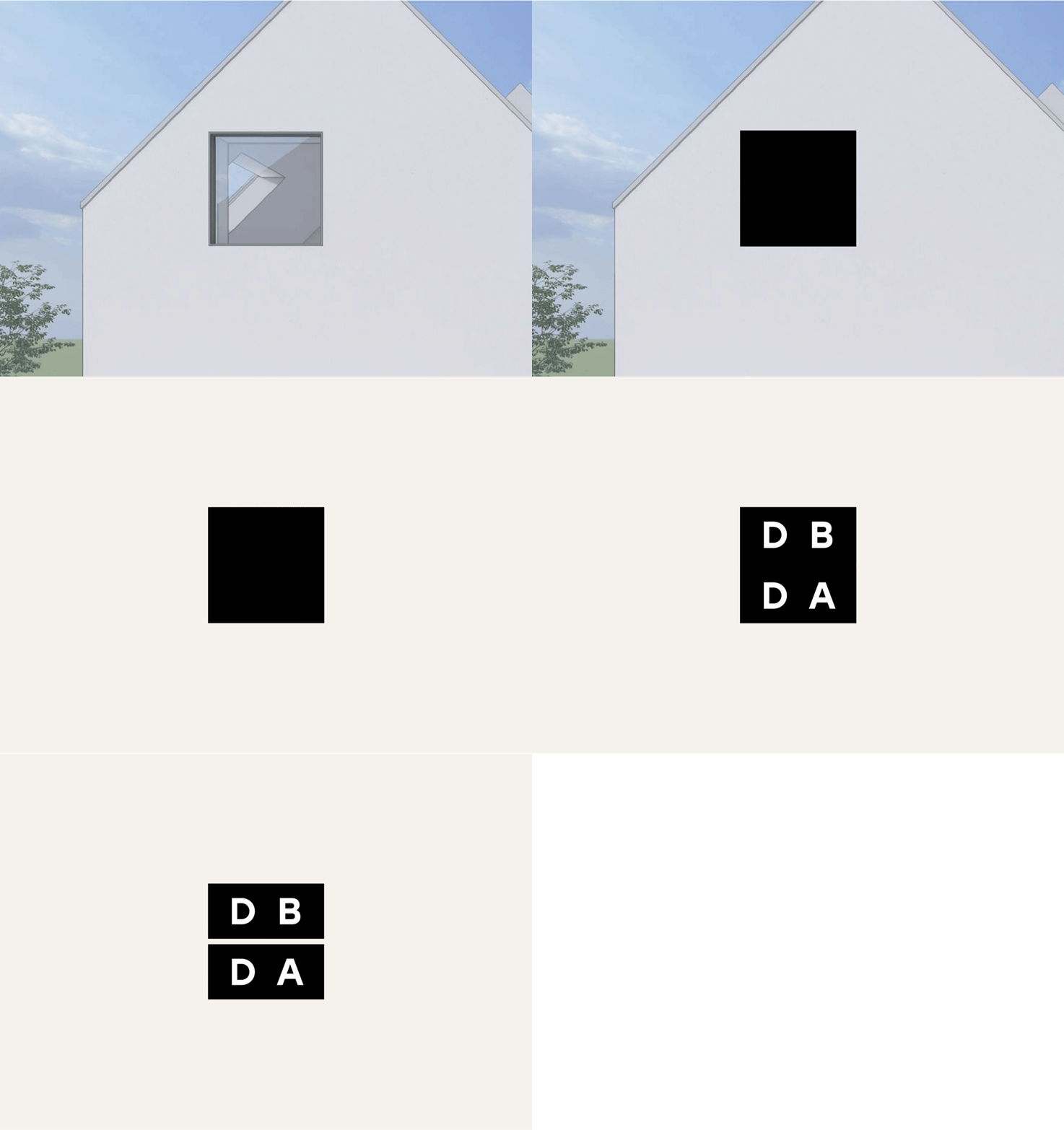
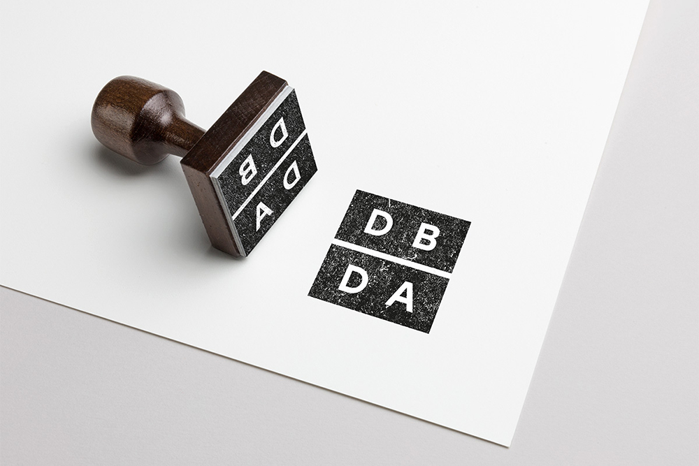
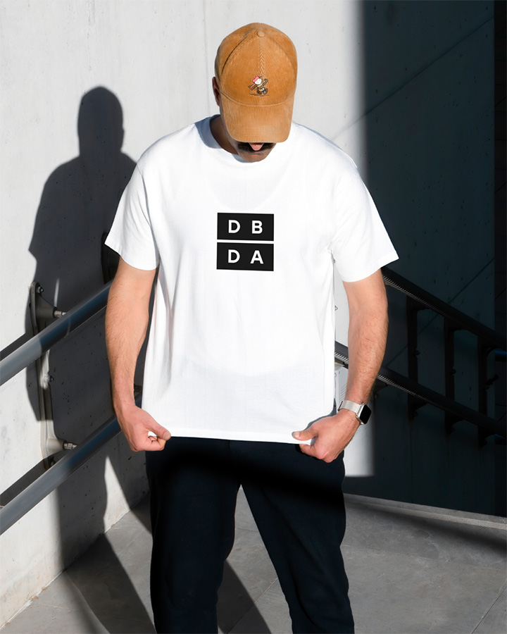
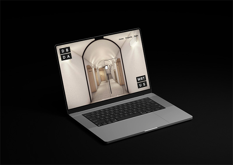
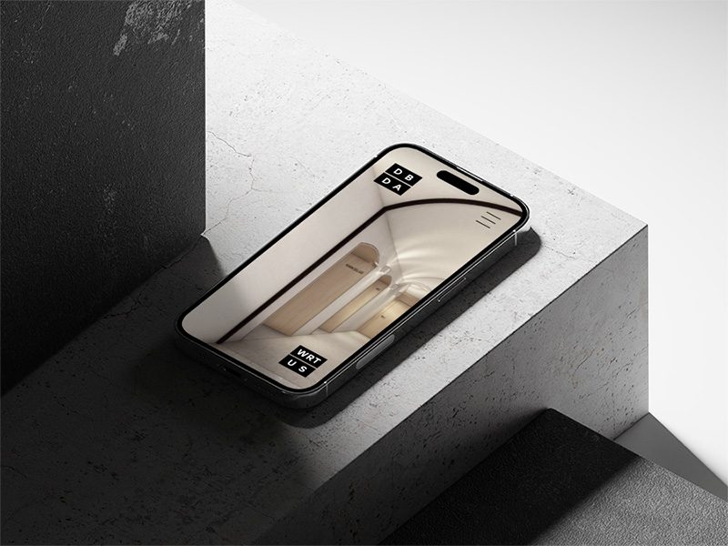
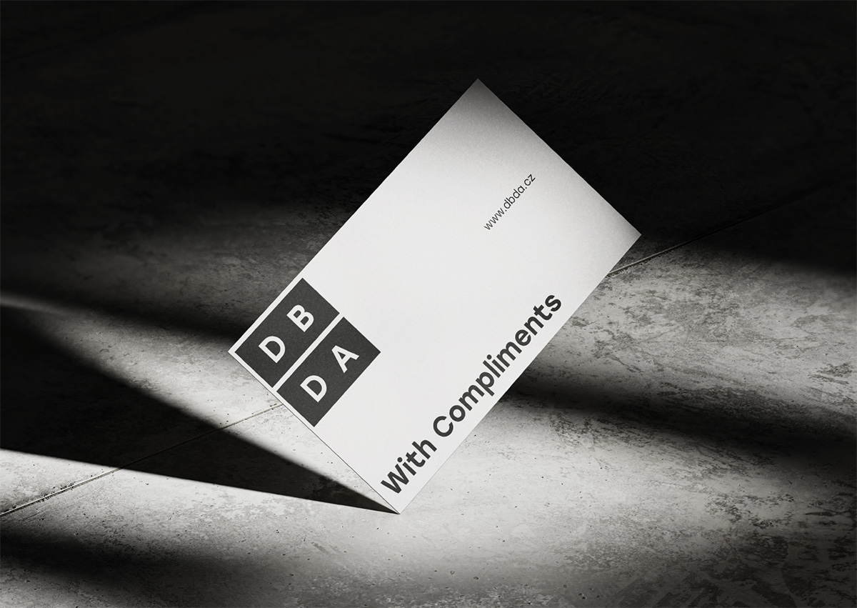
The clients wished to feature a square in their new visual identity, as the primary shape in their work. I integrated it directly into the logo – the square is divided into rectangles, aiding name reading and symbolizing building blocks. One aspect of the visual identity introduces a fullscreen fluid logo, dynamically shaping the format. This versatile element can be applied to special print materials, wall signs or a blueprint stamp.
"Design Buildings,
Design Architecture"
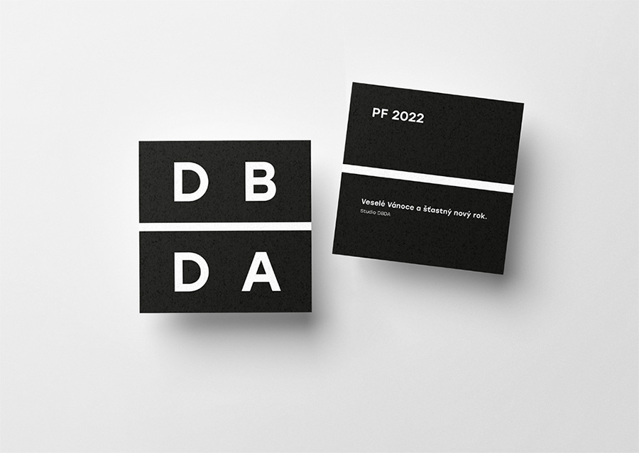
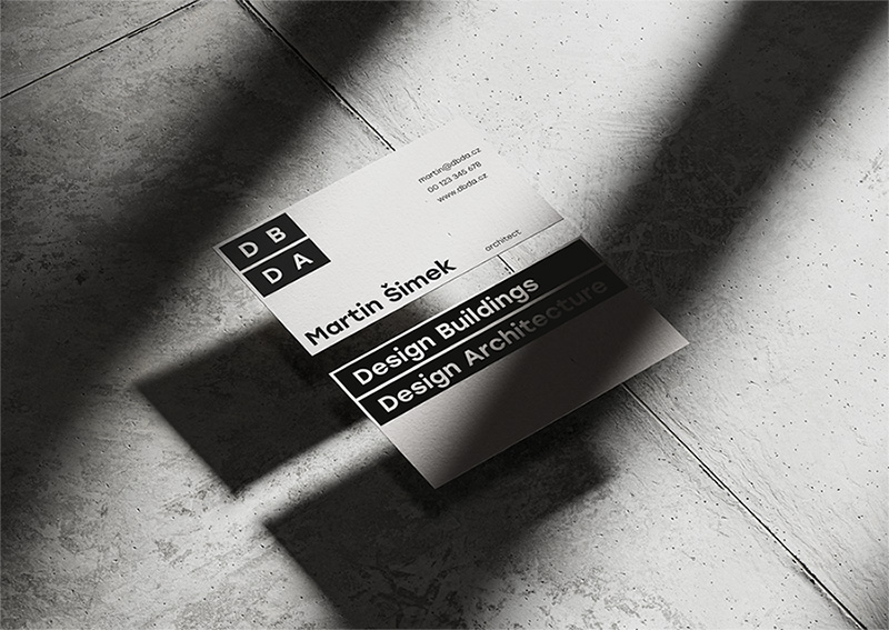
Another visual identity aspect includes the full company name alongside the logo, addressing the client's request given the studio's new presence in the market and the name's evolving significance. To navigate this, I crafted a dual-sided visual system. The front side features the primary logo, while the back side unveils the complete company name.

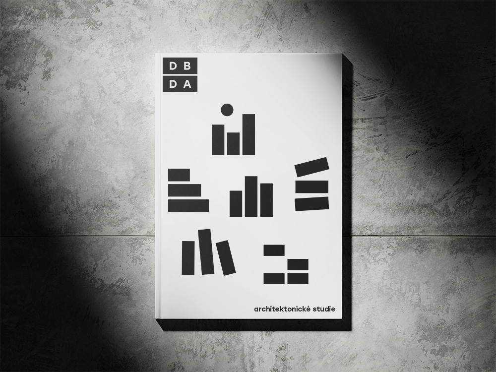
Simple blocks as an icons, especially used in studies or to represent different commissions.

MARTIN ŠIMEK
"We especially appreciate the minimalist logo, playfulness and creativity. Due to its shape, the logo has the most universal possibility of use on various media."
Architect & CEO, DBDA
Client
Brand Design
Veronika Holíková
Selected Works
DekidsFashion Brand
Workshop BoxDevelopment Tool
UNIGCurtain E-shop
Amigo CouponsDigital Coupons
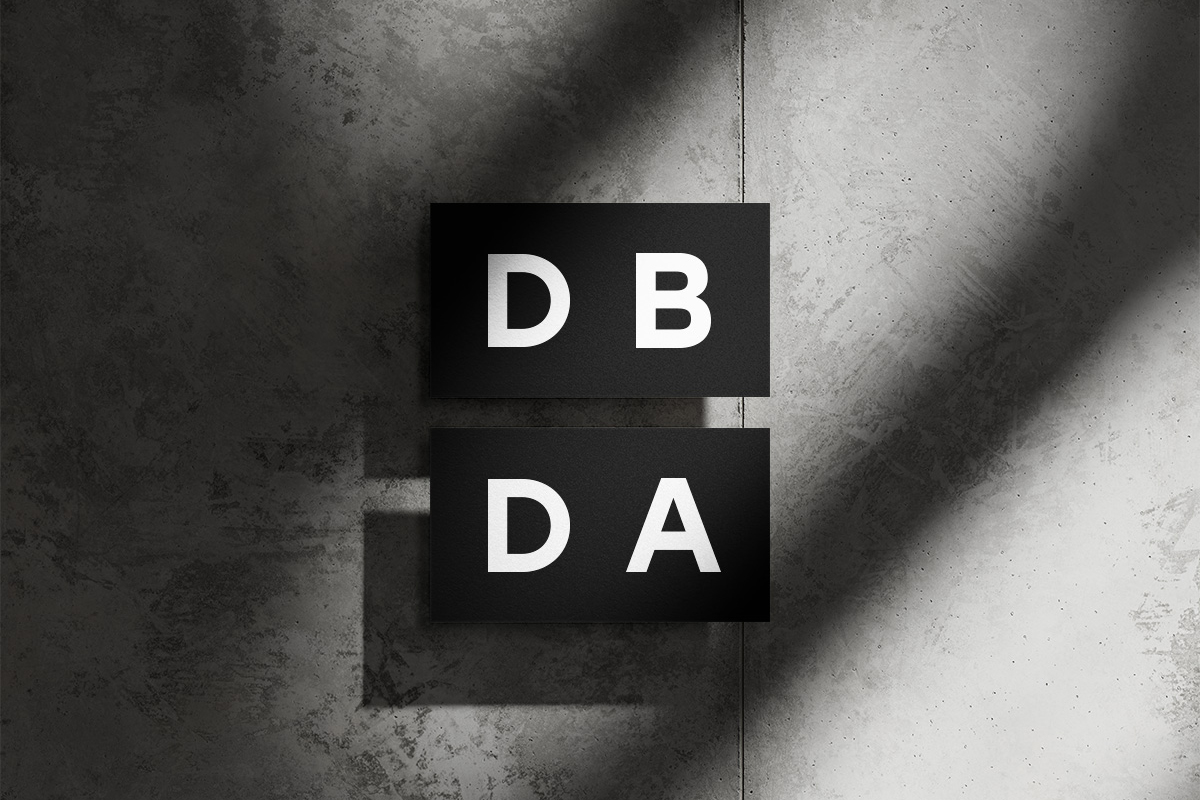
DBDAArchitectural Studio
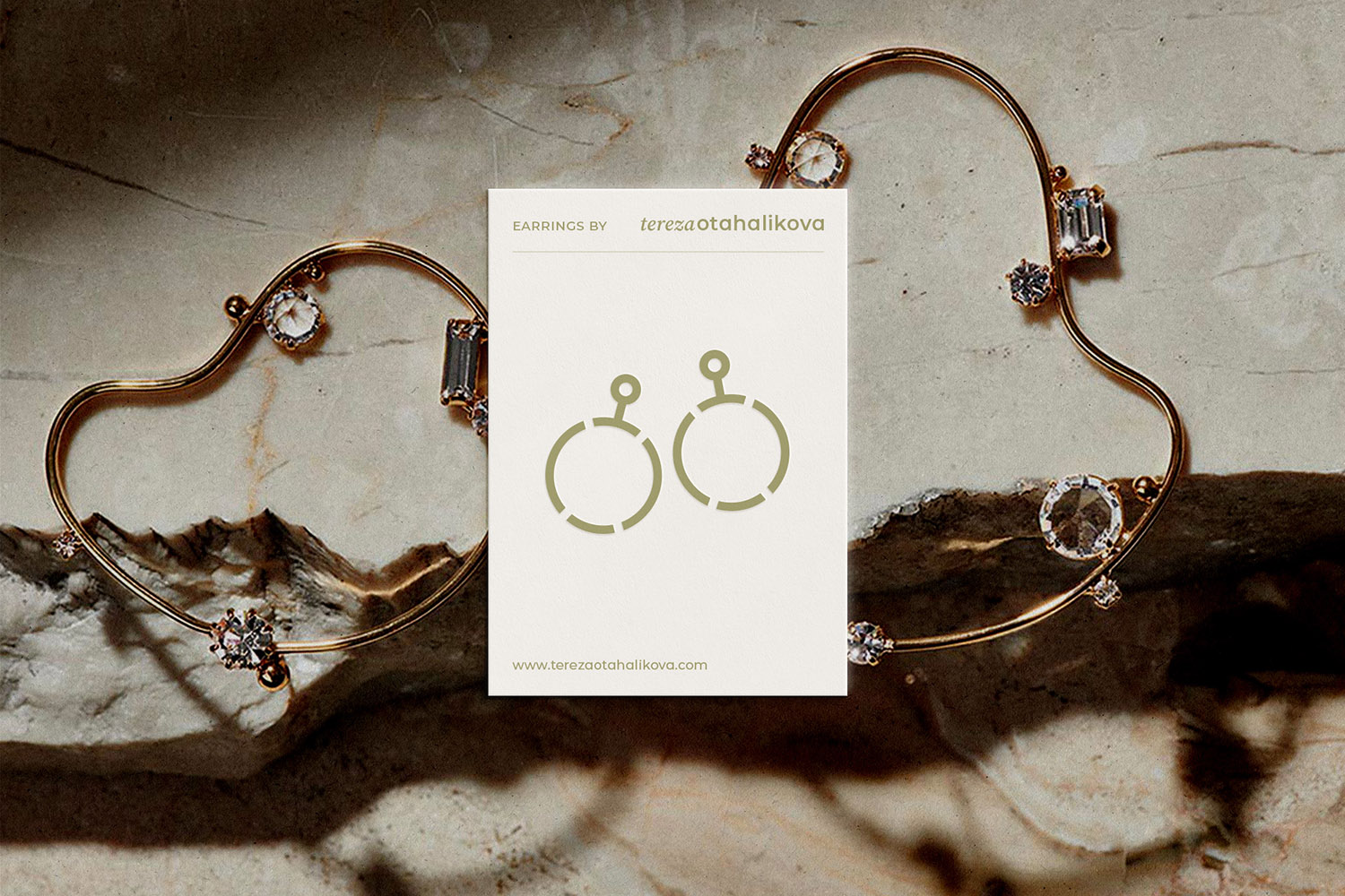
Tereza OtahalikovaBijou Jewelry
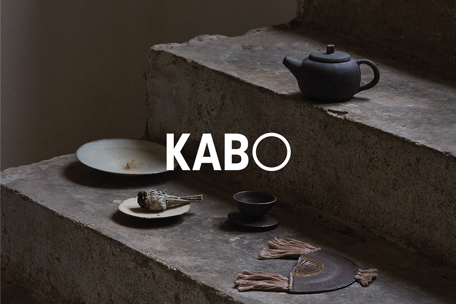
KABO CeramicsCeramic Studio & Shop
The City of PilsenCzech City

PopUpShowMilan Design Week Exposition
