KABO CERAMICS
Capturing the
unique spirit
of a ceramic studio
Background
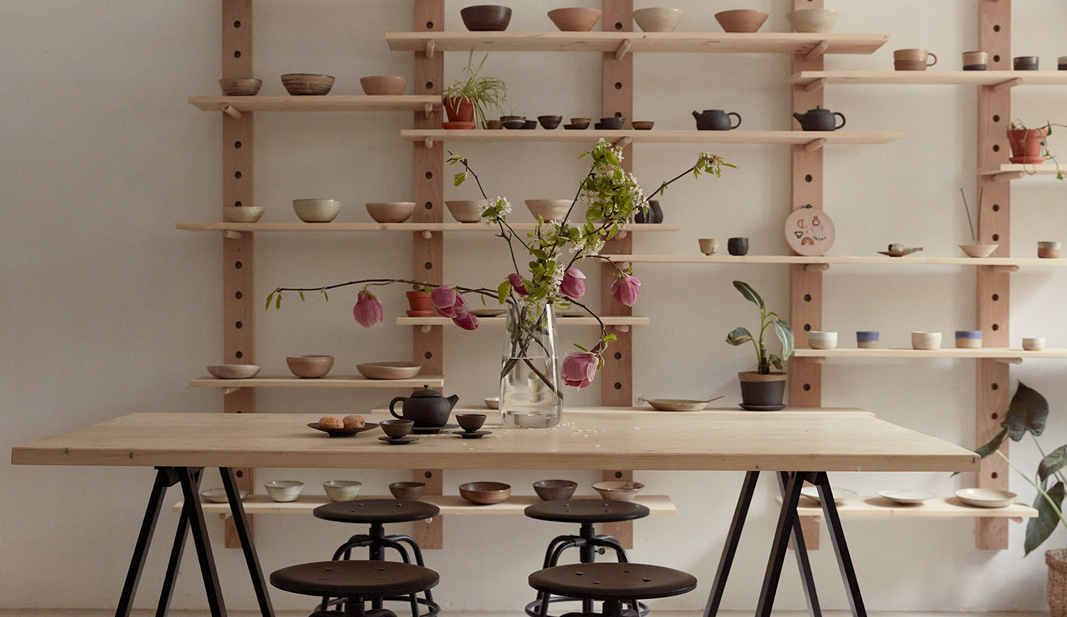
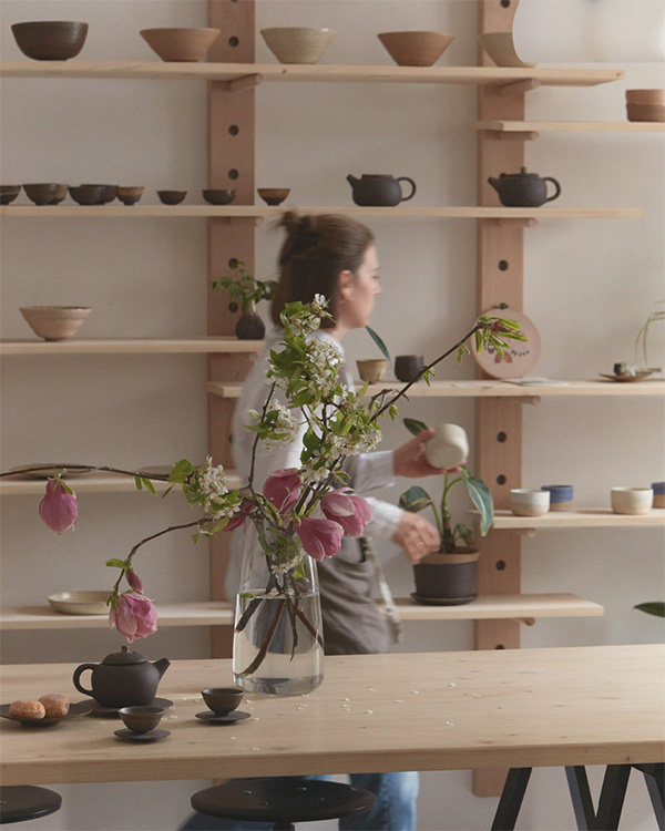
Right in the heart of Prague, KABO Ceramics is a charming pottery studio founded by Kateřina Borovcová. Her meditative approach to creation results in unique, handcrafted products. Beyond being a shop and studio, KABO Ceramics opens its doors to a creative community through pottery workshops. I shaped the logotype and visual identity in 2021.
A potter's wheel
meets spirituality.
In a logo.
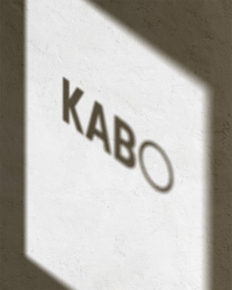
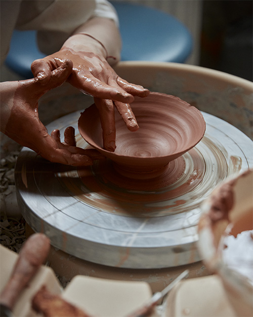
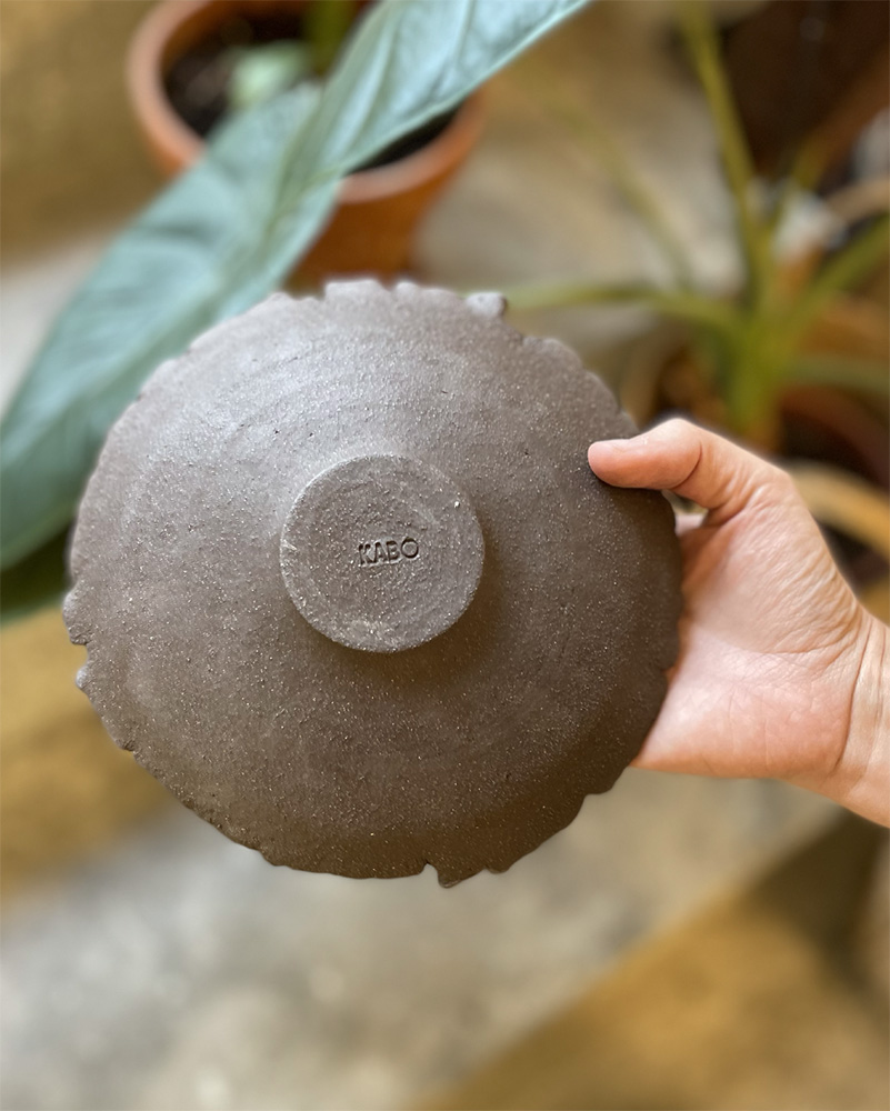
Designing a logo posed a challenge — creating diverse meanings and ensuring easy reproducibility, especially in clay. The client aimed to convey unity from studio workshops and spiritual vibes. The solution? A circle, replacing a letter in the name. This symbol captures togetherness, sacredness and visually alludes to a ceramic product or potter's wheel.
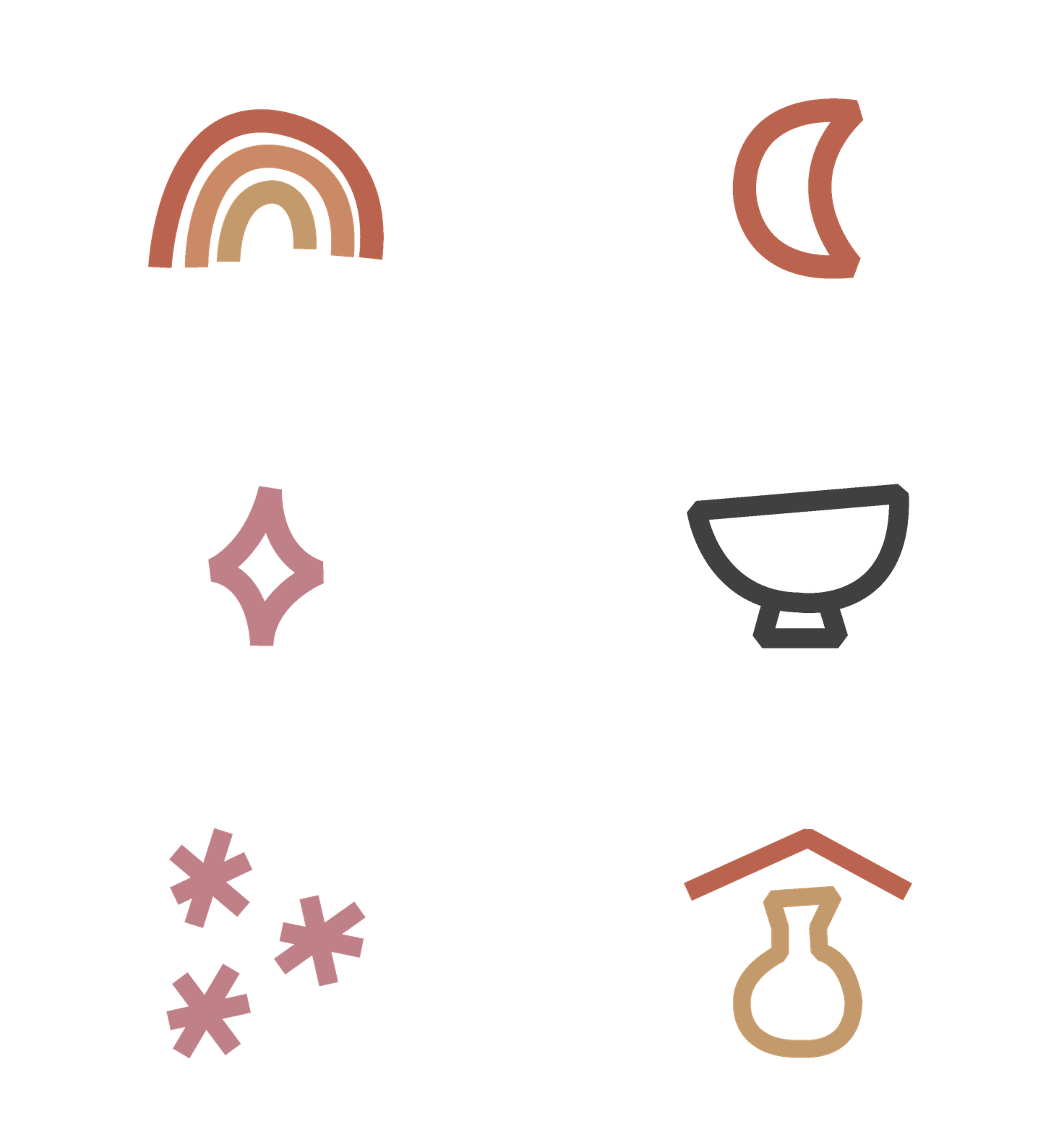
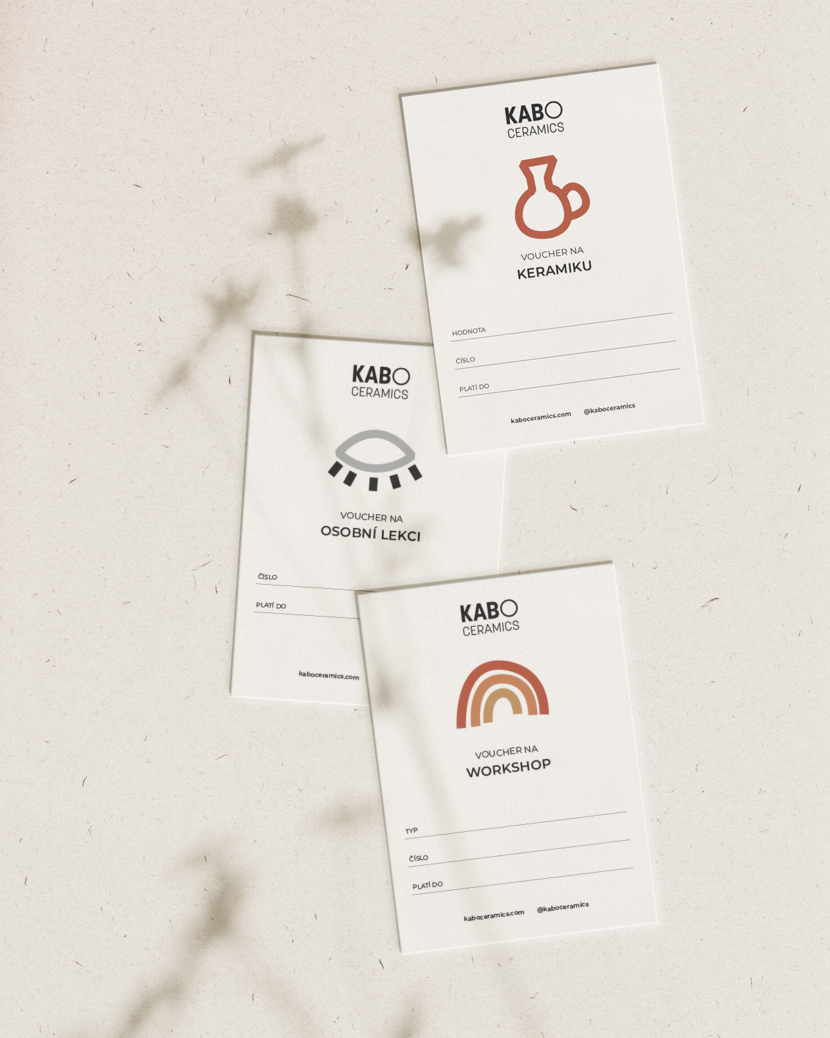
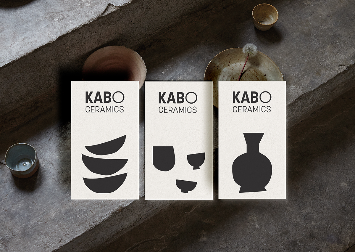
Raw and mystical
icons express KABO's essence. The color code is earthy and playful,
just like clay.
KATEŘINA BOROVCOVÁ
"Veronika did a great job, praised by many clients. She perfectly integrated the design with my ceramic work."
Founder & Girl Boss, KABO Ceramics
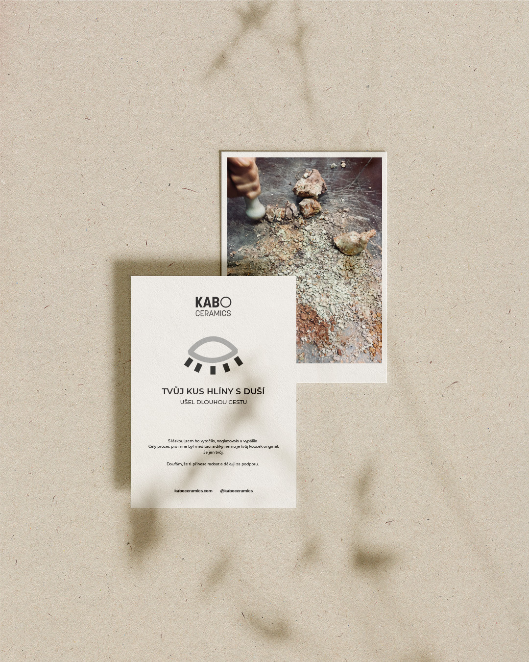
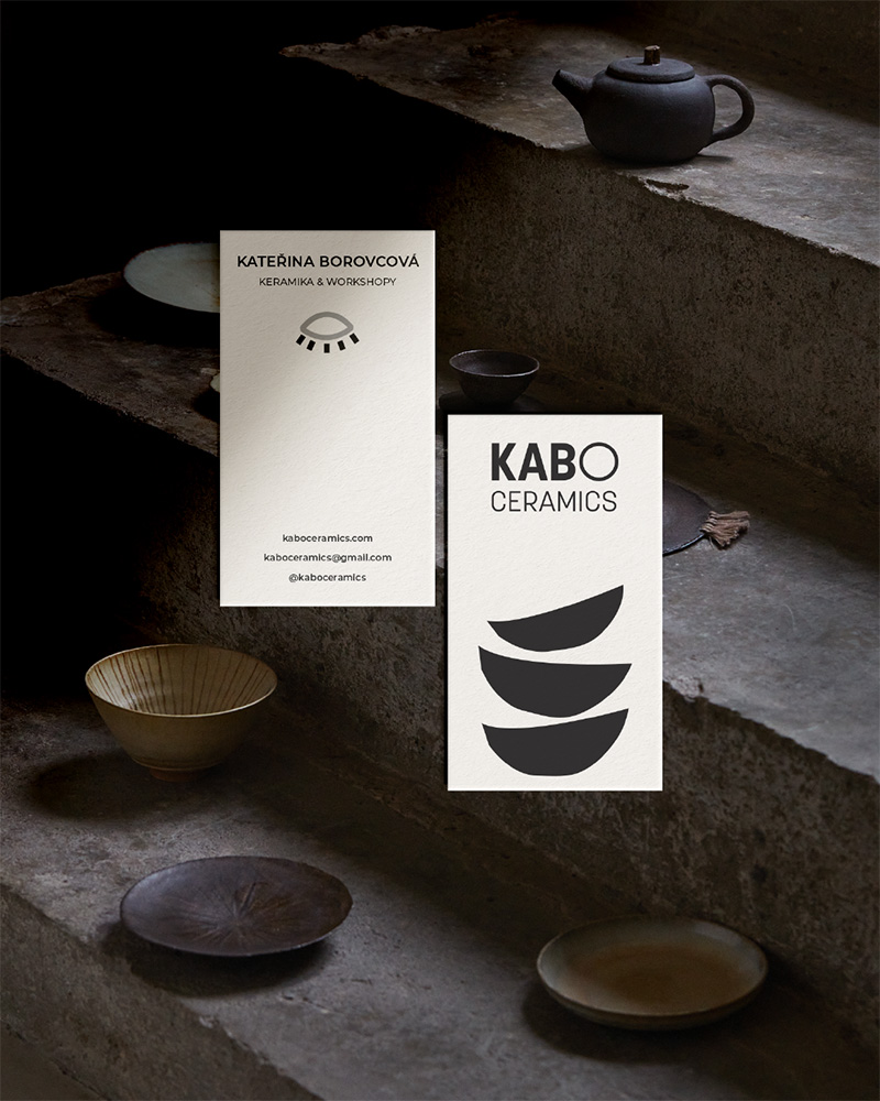
Raw illustrations capture the perfect contours of handmade items.
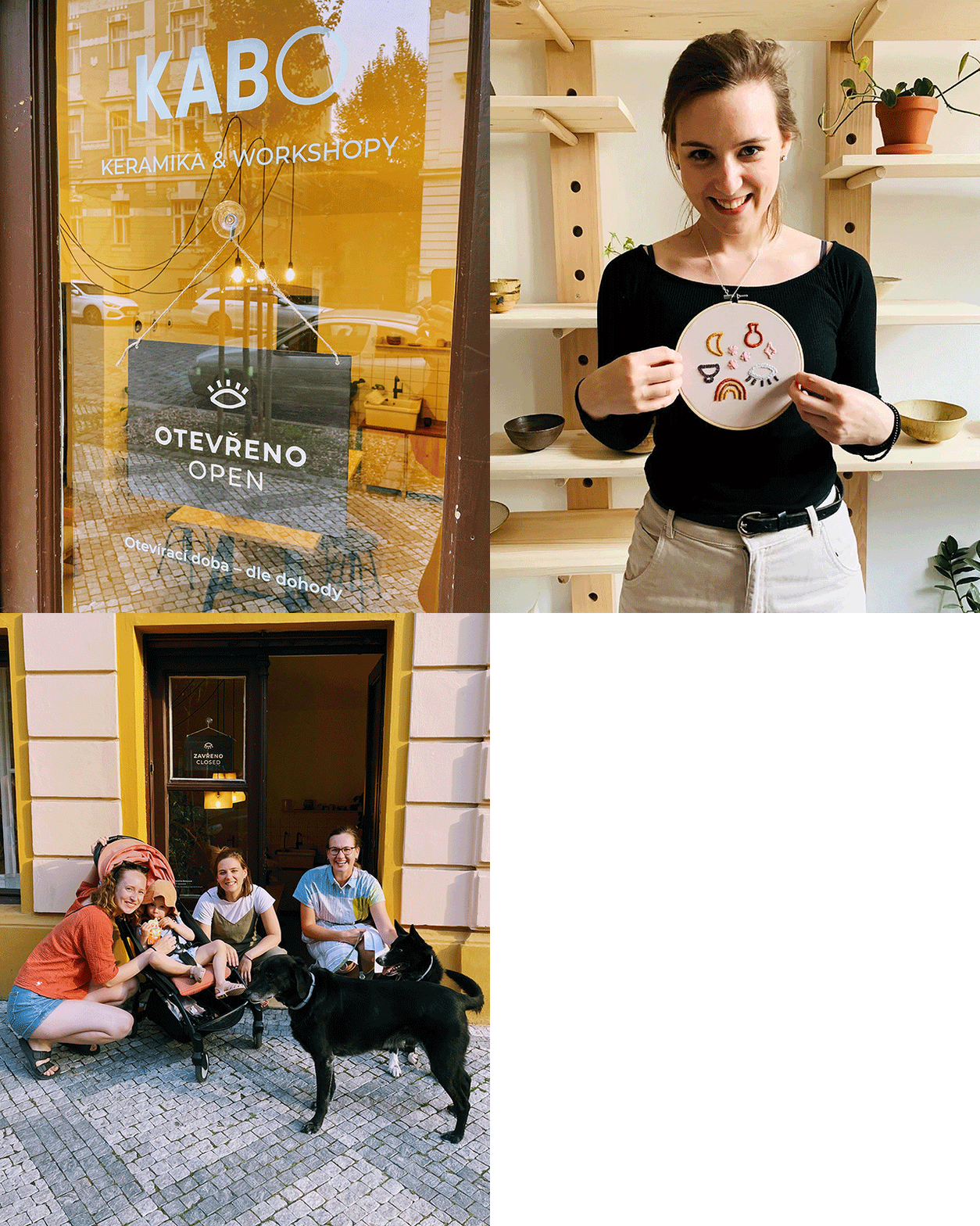
Hand-painted sign,
embroidery
and community.
Crafting this identity allowed me to experiment with various materials, pushing the boundaries of logo and visual identity reproducibility, from clay to hand-painted signs and embroidery. I'm delighted that KABO is now a recognized part of the local community and a hub for talented spirits, from artists to our four-legged friends.
Selected Works
DekidsFashion Brand
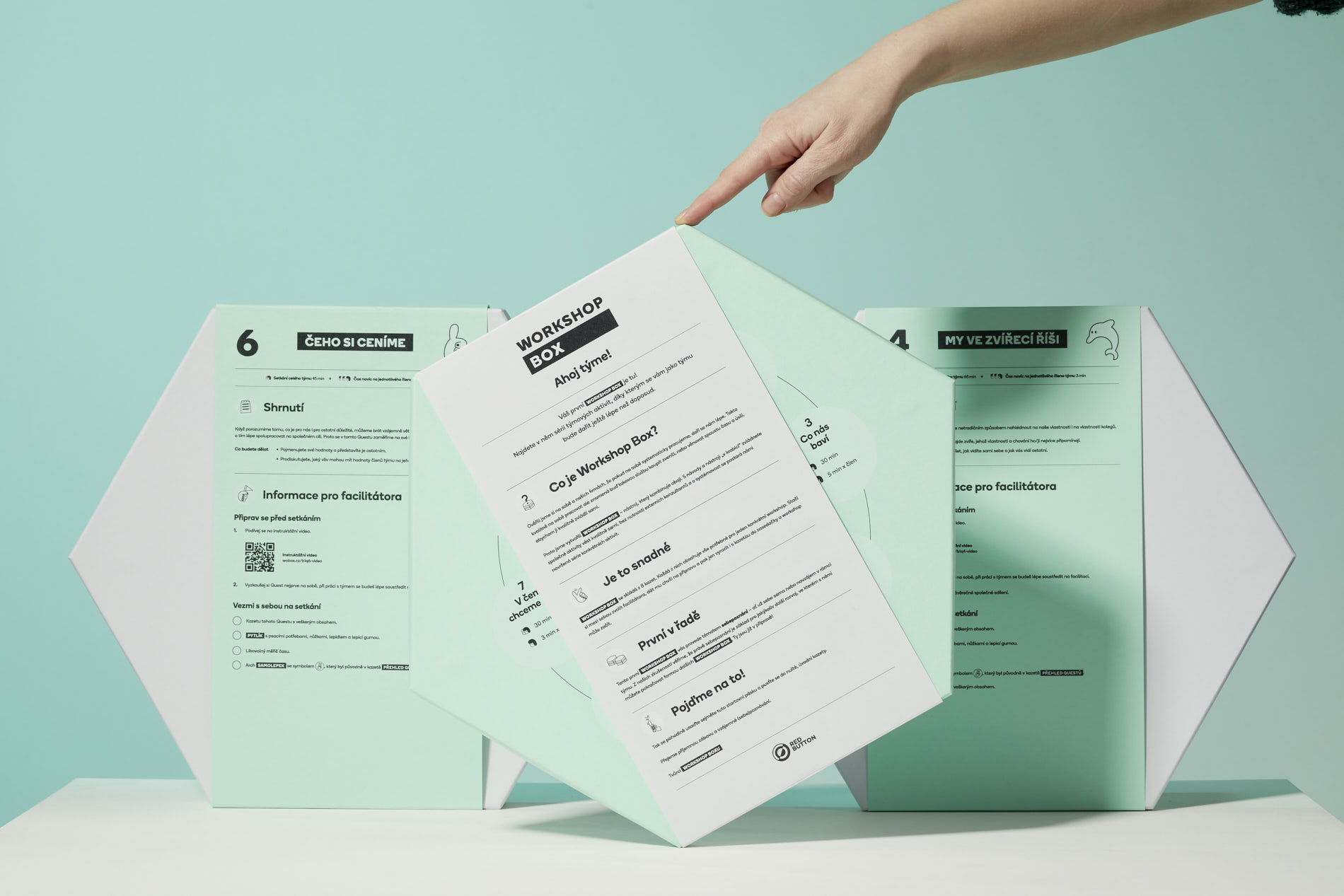
Workshop BoxDevelopment Tool
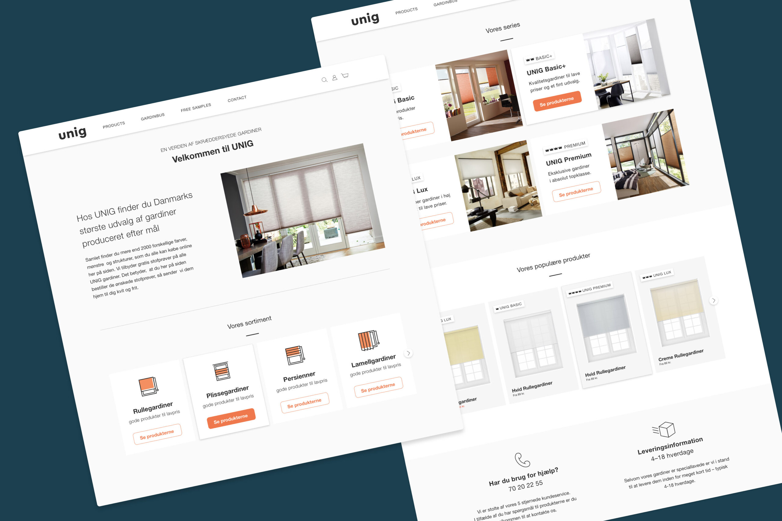
UNIGCurtain E-shop
Amigo CouponsDigital Coupons
DBDAArchitectural Studio
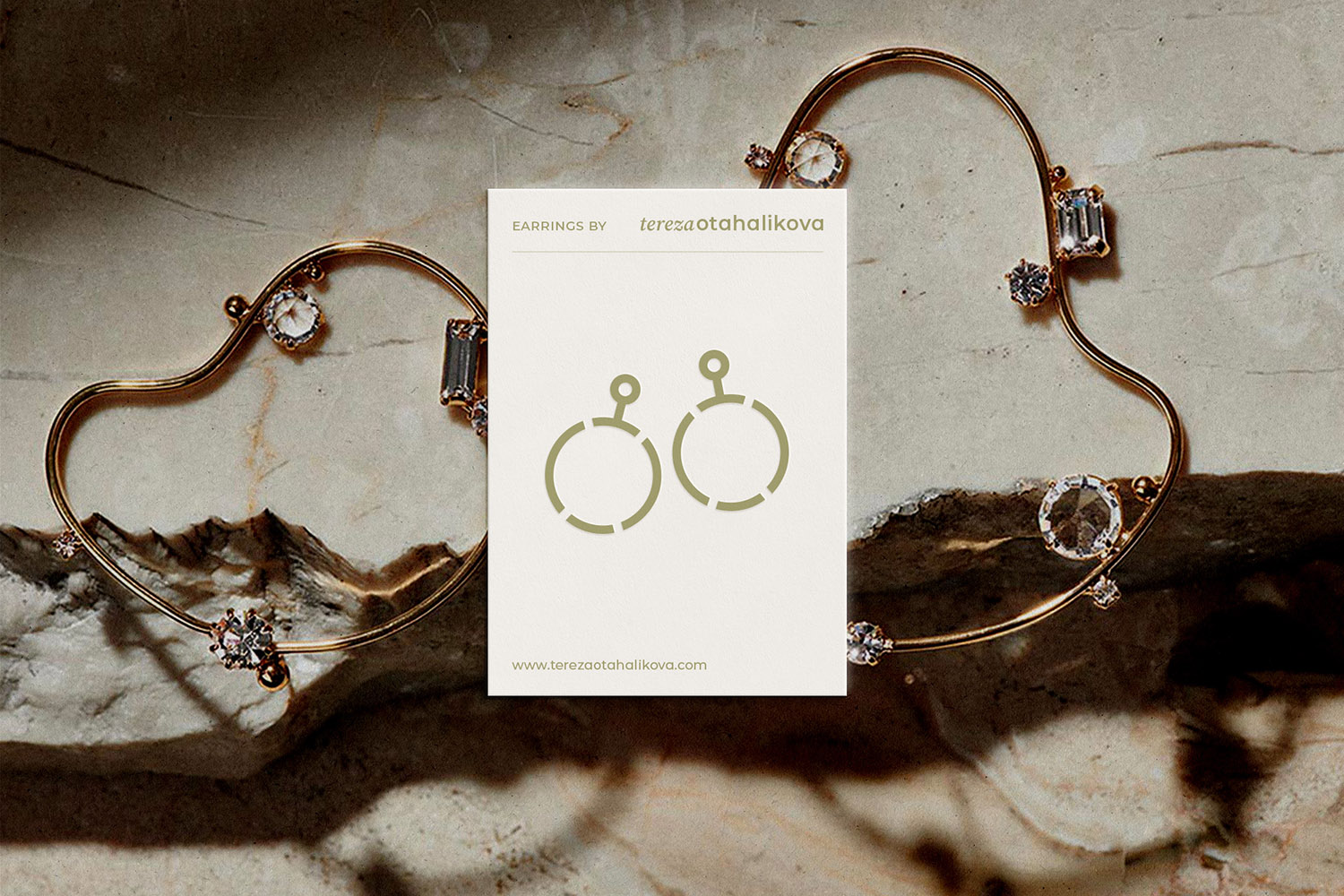
Tereza OtahalikovaBijou Jewelry
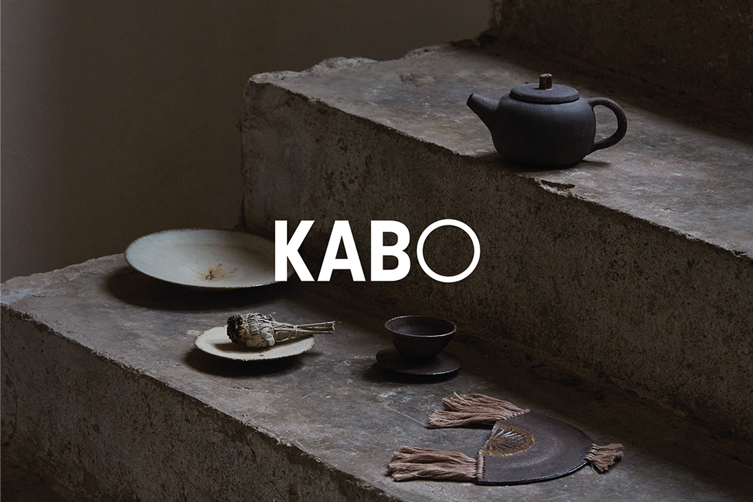
KABO CeramicsCeramic Studio & Shop
The City of PilsenCzech City
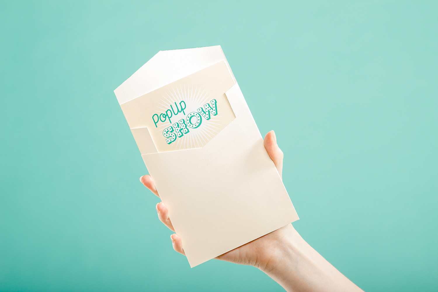
PopUpShowMilan Design Week Exposition
