

TEREZA OTAHALIKOVA
A new identity
for the Czech
queen of bijou
Background
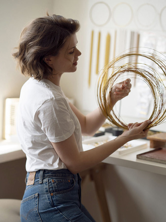
Tereza Otahalikova, a.k.a. "The Czech Queen of Bijou," is a young jewelry designer based in Prague. Her creations celebrate traditional Czech bijouterie, renowned worldwide. Using vintage bijou components, she transforms them into modern and unique pieces of jewelry. In 2022, I had the honor of refreshing her visual identity.


Challenging
my old design
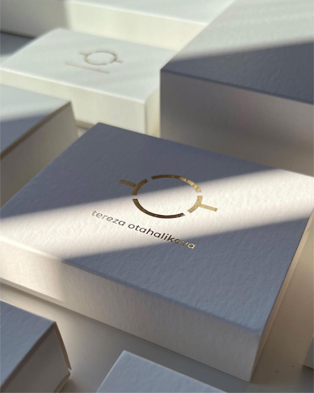
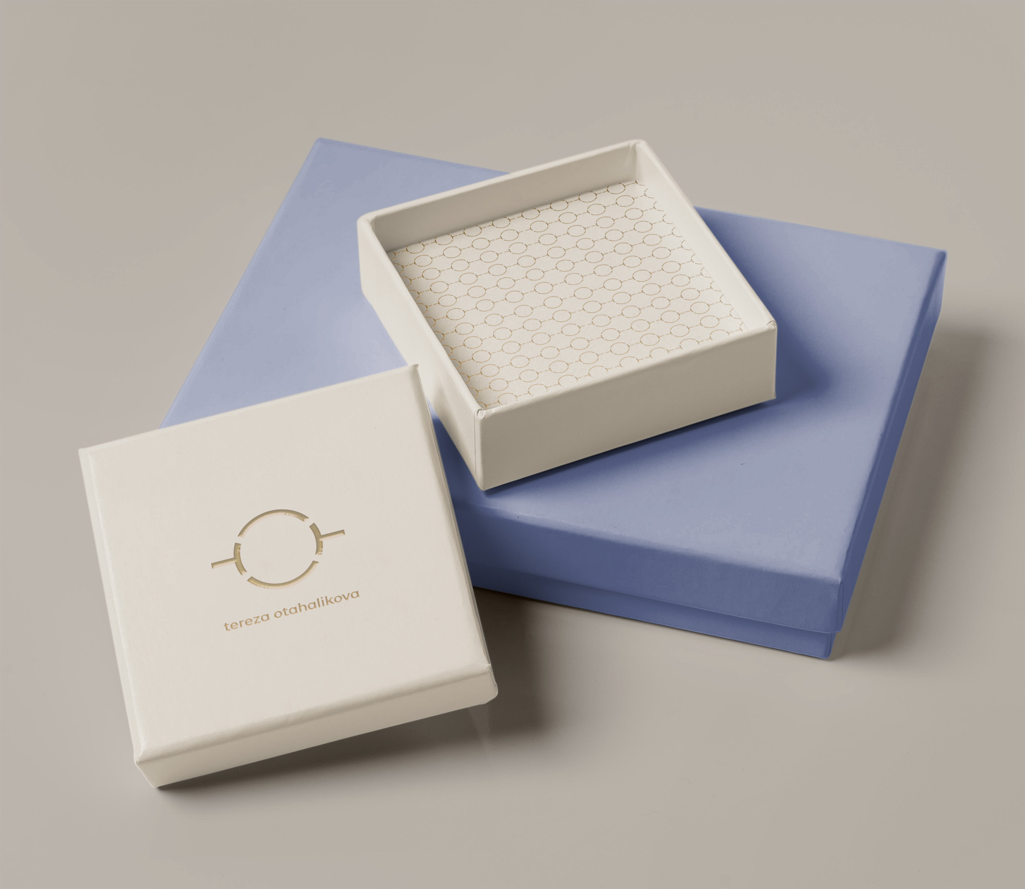
Knowing Tereza since our student days, I crafted the original logo in 2015. Despite Tereza's evolving design style, the symbol I created still resonates with both of us, and we decided for a simple design facelift. The symbol combines Tereza's initials (O and T), resembling a ring and with its fragment design symbolizing the art of bringing pieces together to create unique jewelry. Refreshing my old design was undeniably challenging, but I enjoyed every minute of it.
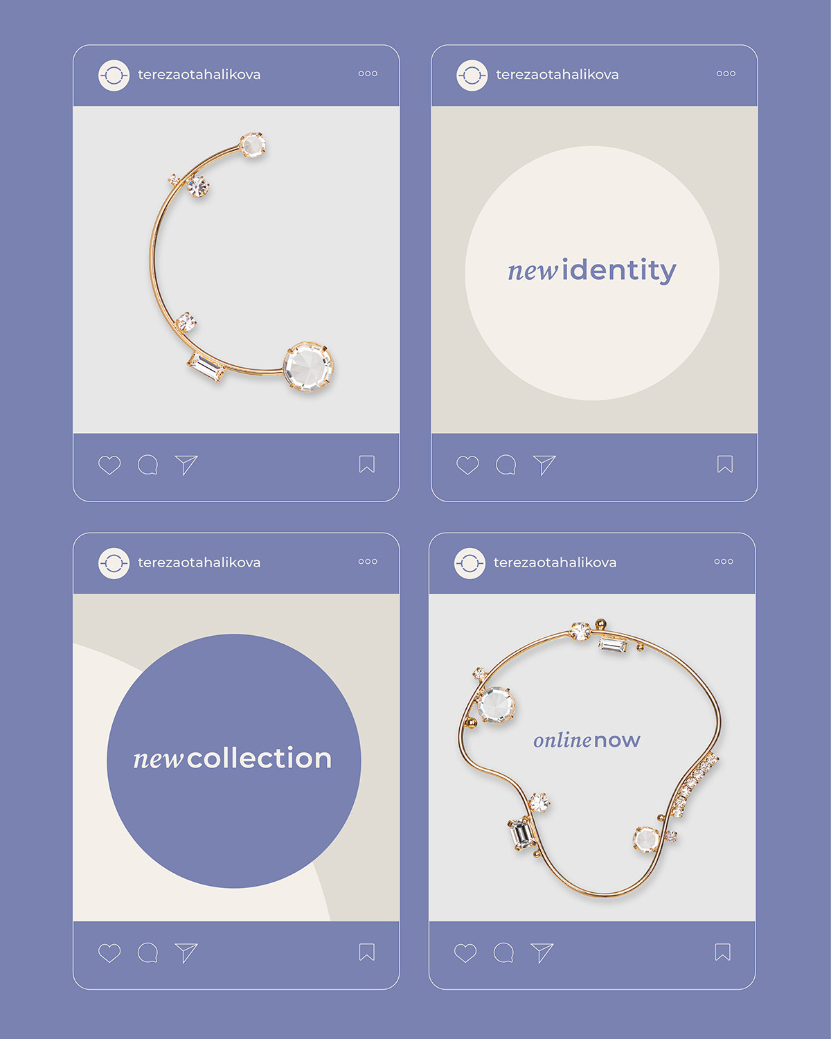
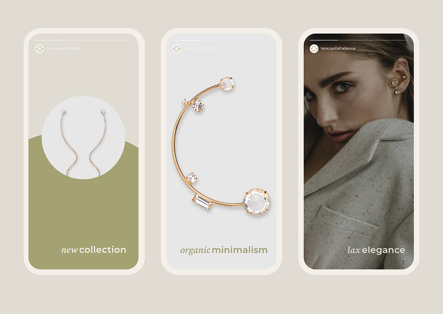
A new set of icons
is defining various
jewelry types.
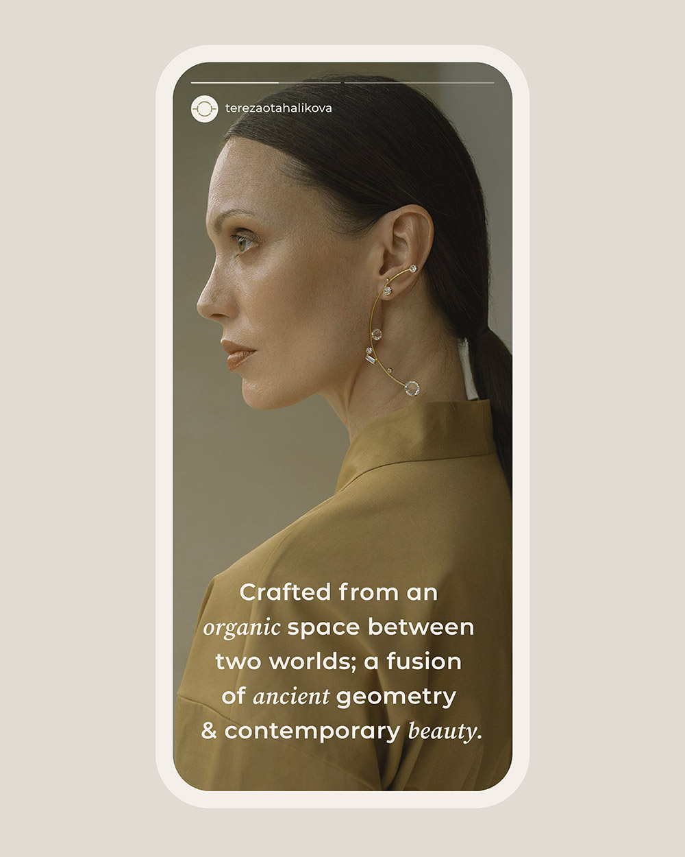
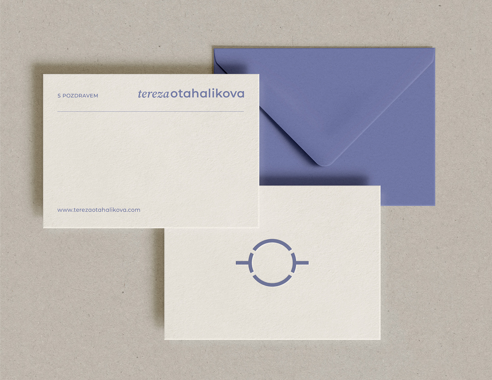
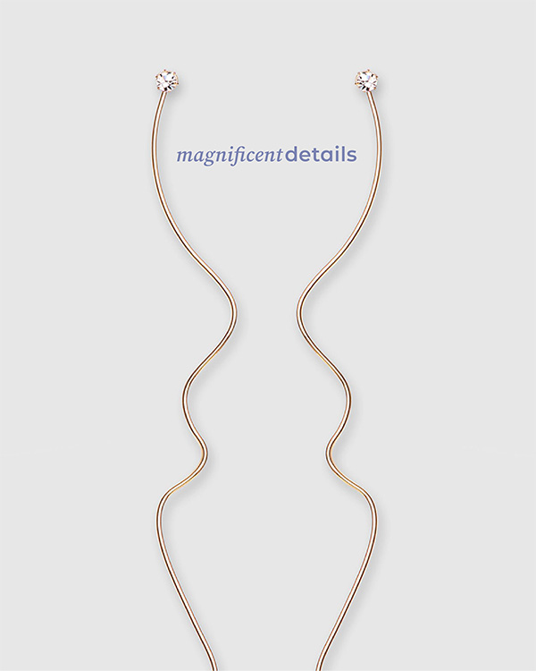
The identity blends old and new styles, echoing Tereza's creations. Especially in the typography where serif meets geometry.


We sought a fresh
and gentle color palette, accenting feminity,
as the main audience
is women.
TEREZA OTAHALIKOVA
"After eight long years, I decided to refresh the original logo. The original design was made by the wonderful Veronika, and even today I wouldn't collaborate with anyone else."
Founder & Girl Boss, Tereza Otahalikova
Selected Works

DekidsFashion Brand

Workshop BoxDevelopment Tool

UNIGCurtain E-shop

Amigo CouponsDigital Coupons
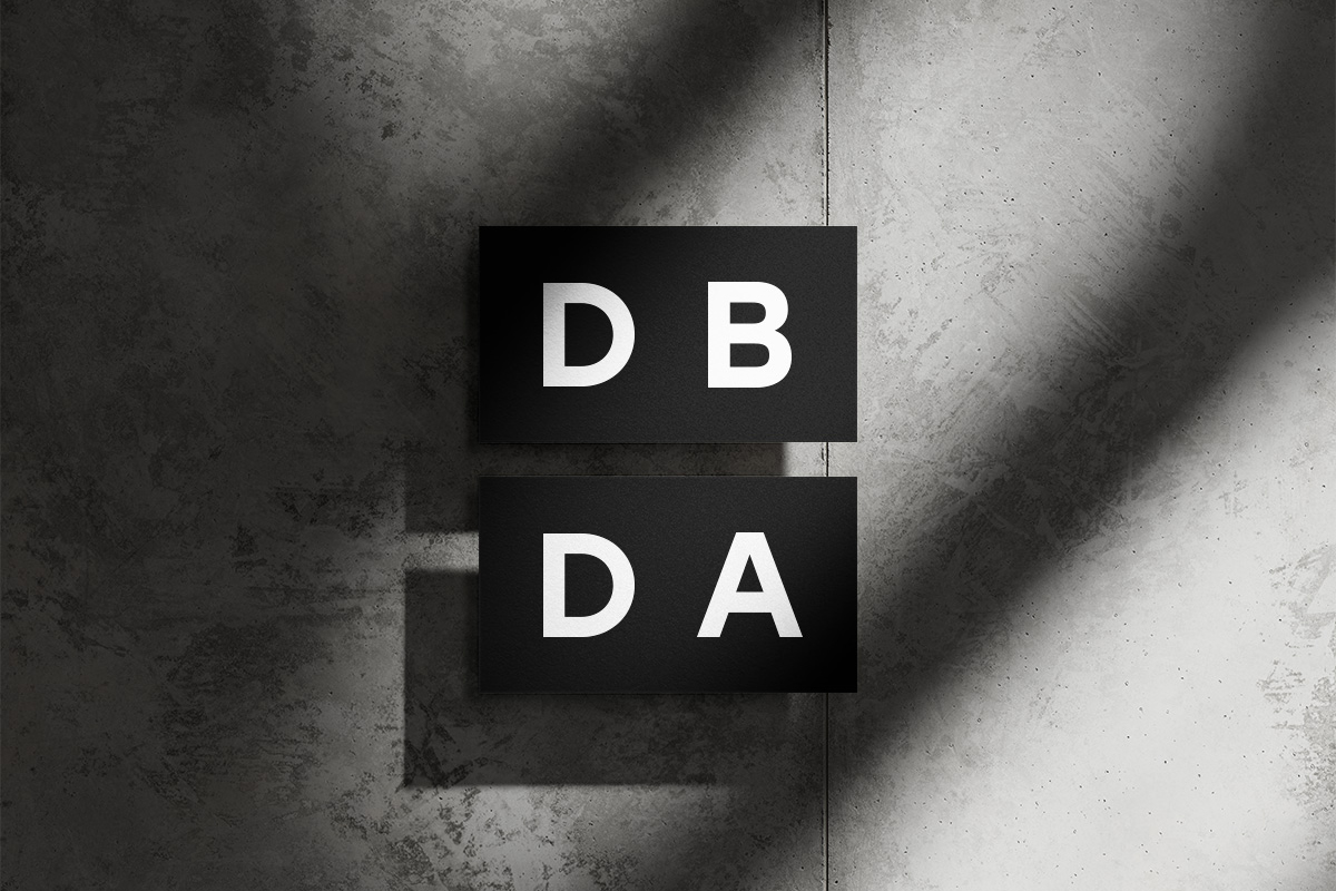
DBDAArchitectural Studio
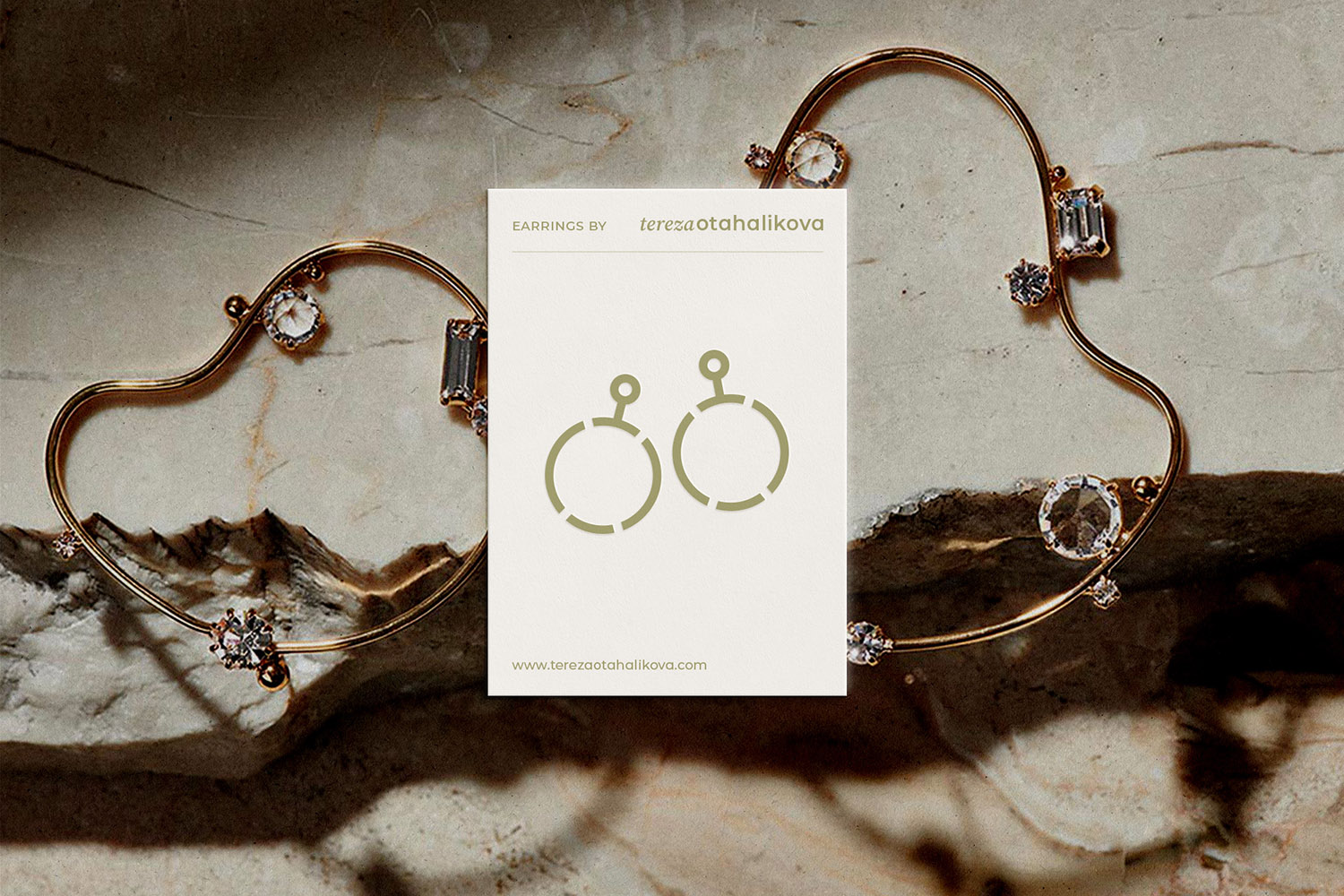
Tereza OtahalikovaBijou Jewelry
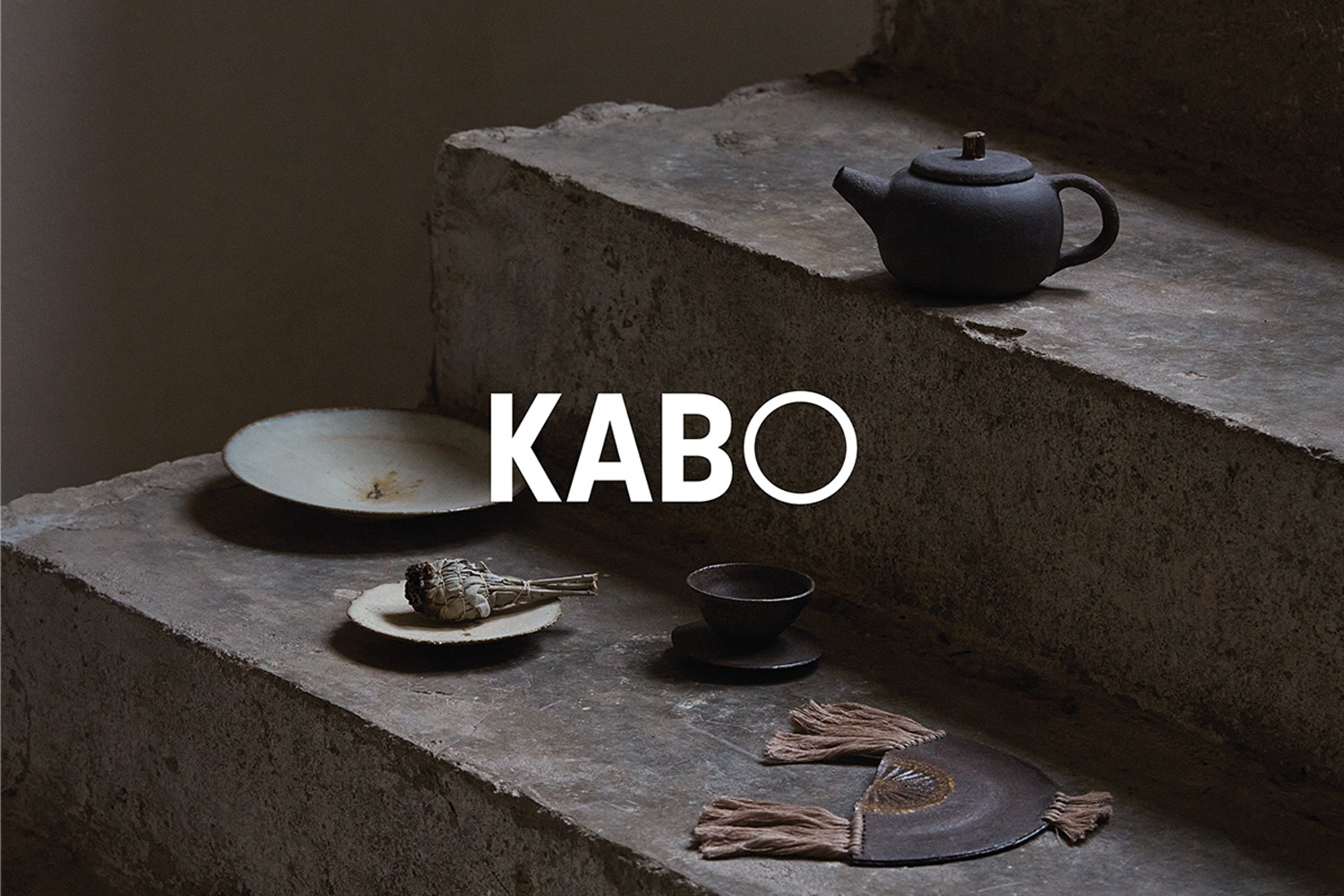
KABO CeramicsCeramic Studio & Shop

The City of PilsenCzech City

PopUpShowMilan Design Week Exposition

